How to Plot a CSV File Online with Dataplotter (No Coding Required)
If you have a CSV file, you probably don’t actually want the file, you want to understand the data inside it. A simple chart can instantly reveal what the data means.
DataPlotter is a free online data plotter that lets you upload CSV or Excel files and instantly generate charts directly in your browser. You can open the tool and follow this guide step-by-step while plotting your own data.
The Problem With Traditional Methods
Excel Charts: Users frequently encounter confusing menus, broken date columns, and messy formatting.
Python/Coding: Tools like Matplotlib are powerful but require software installation and coding knowledge.
Step‑by‑Step Guide
1. Prepare Your CSV
Before uploading, taking a few seconds to format your file will save you time later:
- Headers in Row 1: Ensure the very first row contains your column names (e.g., "X", "Y") with no empty rows above it.
- Clean Data: Make sure numbers don't contain extra text or currency symbols
(e.g., use
1200instead of$1,200). - No Merged Cells: If you are exporting from Excel, unmerge any cells and remove summary rows like "Total" at the bottom.
1, 5
2, 7
3, 6
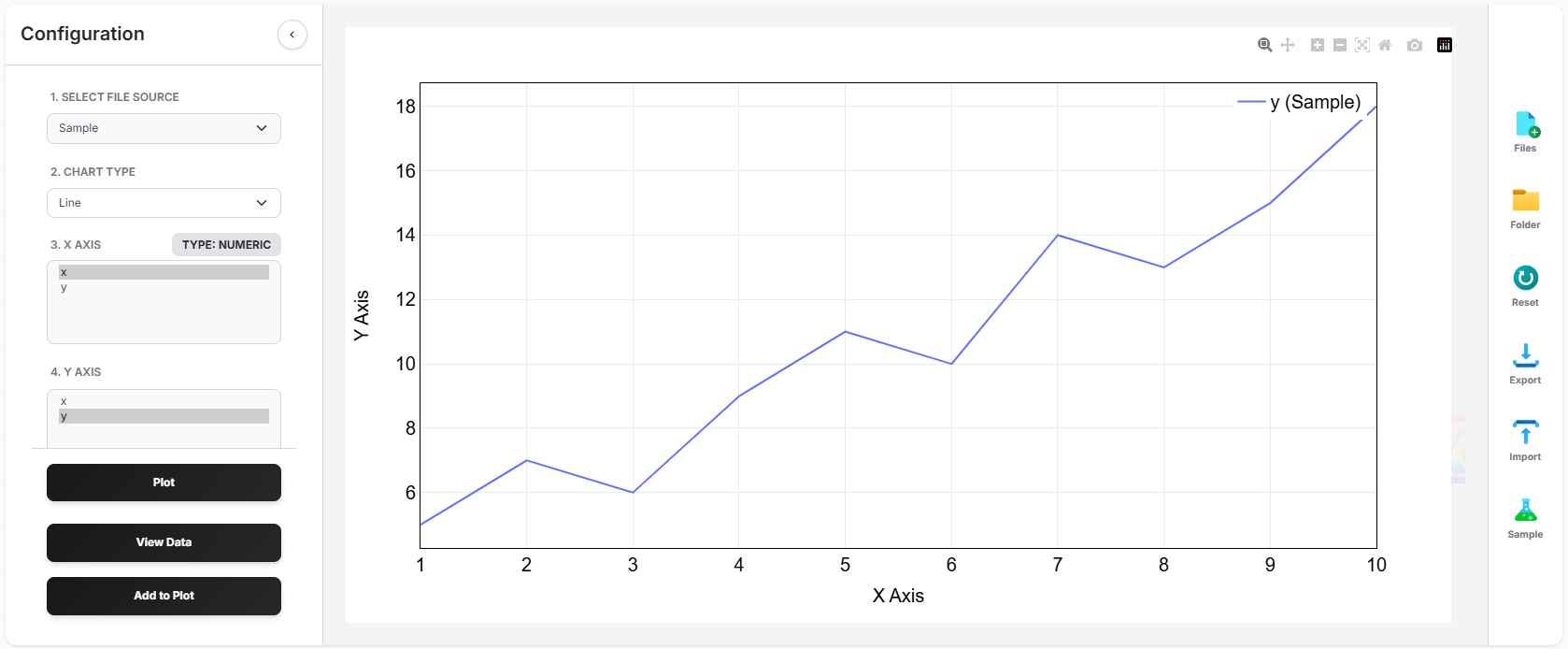
2. Upload to DataPlotter
Go to the Plotter Hub and use the upload buttons: click the  file icon to select individual CSV or Excel files, or click the
  folder icon to easily upload all files inside a folder at once.
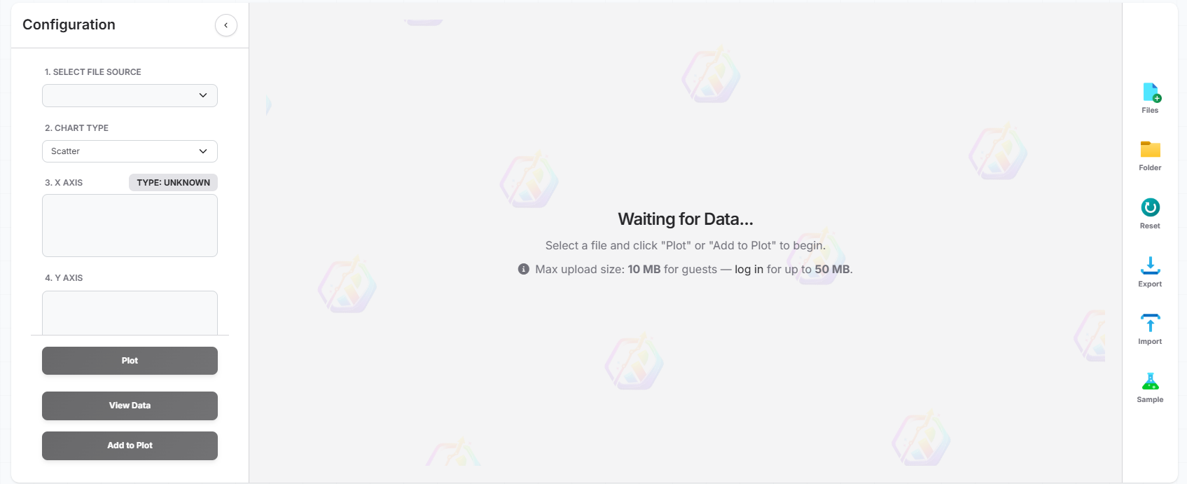
3. Visualize
Once your file is loaded, you'll see a preview of your data columns and an option to view the raw uploaded data if needed. Use the dropdown menus to select your X-axis (e.g., "X") and your Y-axis (e.g., "Y"). DataPlotter will instantly generate the chart right before your eyes—no need to wait or refresh! You can quickly swap columns, change the chart type, or even add multiple traces (extra lines or bars) to the same plot to explore your data from different angles.
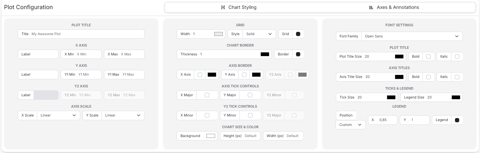
4. Style
Once your plot is generated, you can easily customize its appearance to make it presentation-ready! Use the built-in styling options to add custom titles, adjust the colors of your lines or bars, label your axes, and format the legend. With a few clicks, you can transform a basic chart into a professional, polished graphic.