How to Plot Excel Files Online with DataPlotter (No Coding Required)
Excel spreadsheets are one of the most common ways to store data. Whether you're tracking sales, recording laboratory measurements, analyzing survey responses, or managing business reports, the real value of your spreadsheet comes from understanding the information hidden inside it.
DataPlotter is a free online data visualization tool that allows you to upload Excel (.xlsx and .xls) files directly in your browser and instantly create interactive charts. No software installation, programming knowledge, or complicated Excel formulas are required.
Why Visualize Excel Data?
Looking at hundreds or even thousands of rows inside a spreadsheet makes it difficult to identify important trends. A well-designed chart can immediately reveal patterns, relationships, and unusual values that would otherwise remain hidden.
For example, instead of reading monthly sales numbers one by one, a line chart instantly shows whether sales are increasing, decreasing, or following seasonal patterns.
Interactive charts provide even more value by allowing you to zoom, hover over individual data points, compare multiple datasets, and explore your data from different perspectives.
Supported Excel File Types
DataPlotter supports the most common Microsoft Excel formats.
| Extension | Description |
|---|---|
| .xlsx | Modern Microsoft Excel Workbook |
| .xls | Legacy Excel Workbook |
Most users will upload standard .xlsx files, but DataPlotter can also process older Excel formats depending on their structure.
Step-by-Step Guide
1. Prepare Your Excel Spreadsheet
Spending a few minutes organizing your spreadsheet before uploading it will make visualization much easier.
-
Use column headers.
The first row should clearly describe each column,
such as
Date,Sales,Temperature, orPressure. - Keep one table per worksheet. Avoid multiple unrelated tables on the same sheet.
- Remove merged cells. Merged cells often prevent software from correctly interpreting your data.
- Use consistent data types. Numeric columns should contain only numbers. Avoid mixing text and numeric values.
- Delete empty rows and columns. This makes importing faster and reduces parsing issues.
Jan | 120 | 25
Feb | 145 | 33
Mar | 165 | 41
Apr | 180 | 48
2. Upload Your Excel File
Open the DataPlotter homepage and click the upload button. Select your Excel workbook directly from your computer. DataPlotter automatically reads the spreadsheet and extracts all available worksheets and columns.
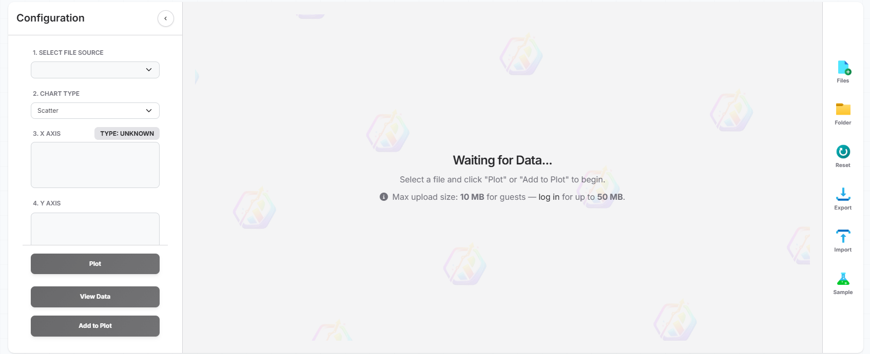
Once the upload finishes, you'll see a preview of the imported data allowing you to verify that every column has been recognized correctly.
3. Select the Columns to Plot
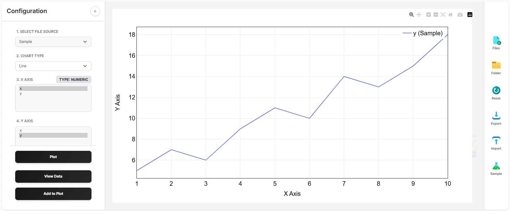
After your spreadsheet has been loaded, choose which columns should appear on each axis.
For example,
Y-Axis → Revenue
or
Y-Axis → Energy Consumption
DataPlotter instantly updates the graph whenever you change the selected columns, allowing you to compare multiple variables in seconds.
4. Choose the Best Chart Type
Different datasets require different visualizations. Selecting the appropriate chart makes your data much easier to interpret.
| If your goal is... | Recommended Chart |
|---|---|
| Show trends over time | Line Chart |
| Compare categories | Bar Chart |
| Find relationships | Scatter Plot |
| Show percentages | Pie Chart |
| Visualize distributions | Histogram |
5. Customize Your Visualization
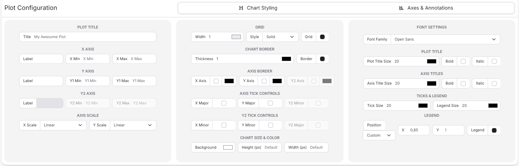
Once your chart has been generated, you can personalize nearly every aspect of its appearance. A well-designed visualization not only looks professional but also makes your data easier to understand.
DataPlotter provides numerous customization options without requiring any programming knowledge.
- Change chart titles
- Edit X and Y axis labels
- Modify colors
- Adjust marker size
- Change line styles
- Display or hide legends
- Customize fonts
- Enable grid lines
- Choose different themes
- Configure multiple traces
Common Excel Upload Problems
Most Excel files upload without any issues. If your visualization doesn't look correct, the spreadsheet itself is usually the cause.
Blank Chart
This usually happens when a text column has been selected instead of a numeric column. Verify that your Y-axis contains numerical values.
Missing Data
Empty cells inside your worksheet can cause missing points in the chart. Fill missing values or remove incomplete rows before uploading.
Unexpected Categories
Merged cells, hidden rows, or inconsistent formatting may create additional categories. Cleaning your spreadsheet usually resolves this issue.
Dates Not Displaying Correctly
Ensure your dates are stored as proper Excel date values instead of plain text. Consistent date formatting improves time-series visualizations.
Excel vs CSV
Both Excel and CSV files work well with DataPlotter. Choosing between them depends on your workflow.
| Excel | CSV |
|---|---|
| Supports multiple worksheets | Single table only |
| Formatting included | Plain text only |
| Can contain formulas | Values only |
| Larger file size | Smaller and faster |
If you only need raw numerical data, CSV files are often faster to process. However, if your data already exists in Excel, there is no need to convert it before using DataPlotter.
Why Use DataPlotter Instead of Excel Charts?
| Feature | DataPlotter | Excel |
|---|---|---|
| Runs in Browser | ✔ | ✖ |
| Interactive Charts | ✔ | Limited |
| No Installation Required | ✔ | ✖ |
| Modern Plotly Charts | ✔ | ✖ |
| Works on Any Device | ✔ | Desktop Only |
DataPlotter is designed for users who want interactive visualizations without writing code or navigating complicated spreadsheet menus.
Frequently Asked Questions
Can I upload .xlsx files?
Yes. DataPlotter supports modern Microsoft Excel workbooks (.xlsx) as well as older Excel formats.
Can I upload multiple worksheets?
Yes. If your workbook contains multiple sheets, simply choose the worksheet that contains the data you want to visualize.
Does DataPlotter store my Excel files?
Your files are processed for visualization. Refer to our Privacy Policy for details about storage and data handling.
Can I customize the chart?
Absolutely. You can modify titles, colors, markers, legends, axis labels, fonts, layouts, and many other visualization settings.
Can I export my chart?
Yes. Once you're satisfied with your visualization, you can export it for presentations, reports, or publications.
Final Thoughts
Excel remains one of the most widely used tools for storing and organizing information, but understanding large datasets becomes much easier when they're displayed visually.
With DataPlotter, you can upload Excel files directly from your browser, generate interactive charts within seconds, customize every aspect of the visualization, and produce publication-quality graphics without installing software or writing a single line of code.
Whether you're analyzing scientific experiments, business reports, engineering measurements, financial records, or classroom assignments, DataPlotter helps transform raw spreadsheets into meaningful visual insights.
Related Guides
Step-by-step guide to visualizing CSV data instantly in your browser without software.
Share password-protected, interactive data stories via a clean web link with your team.
Ready to Visualize Your Excel Data?
Upload your Excel spreadsheet and create beautiful interactive charts in just a few clicks.
Start Plotting Now